An energetic website for the latest social media platform
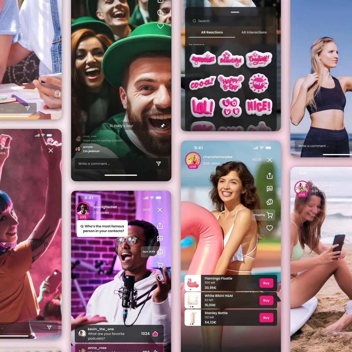
Vinivia is the most interactive live-streaming app, offering an 80% earn rate for Creators — a powerful incentive to produce excellent content consistently. This unique offering addresses major issues in the content-creator economy by prioritising fair compensation and placing value where it’s due; a novel approach not seen on any other platform.
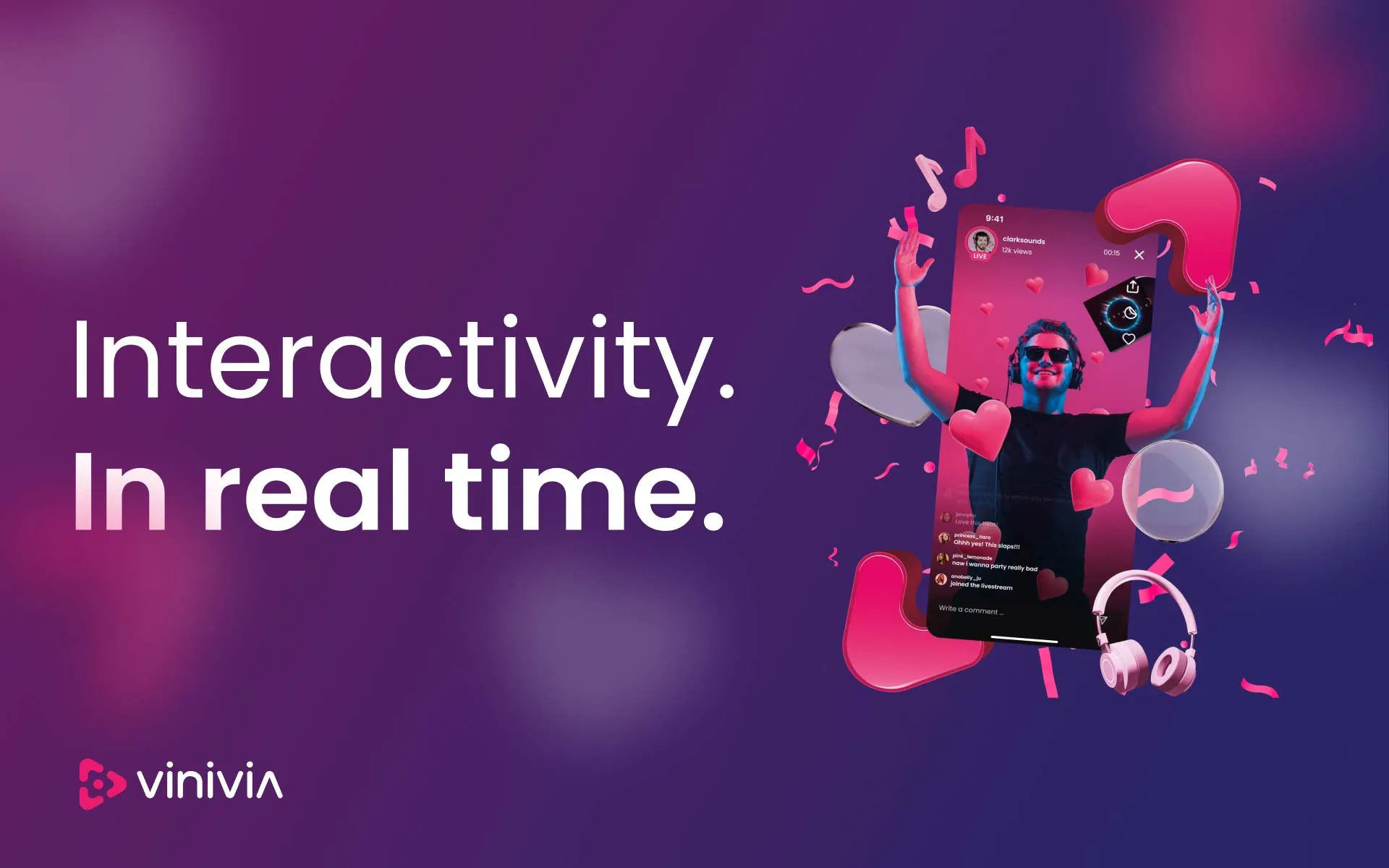
Furthermore, the Vinivia app provides a suite of features designed to empower Creators and elevate their live-streaming experience. From interactive live shopping tools to AI and AR capabilities, Vinivia enhances engagement and connectivity between Creators and their audiences, setting the app apart as an industry leader.
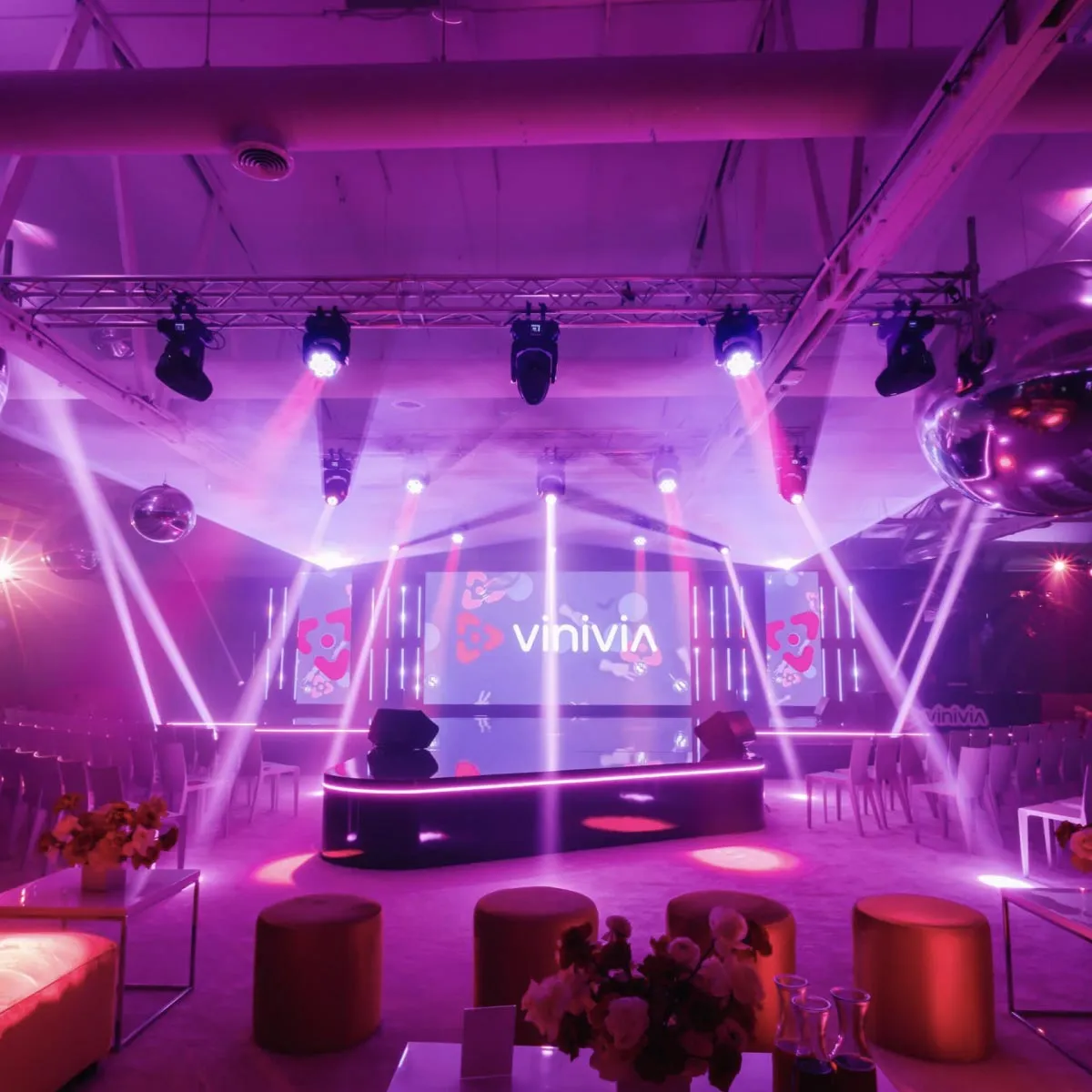
N4 was recruited by Vinivia’s LA team to deliver a website for their A-lister Hollywood launch event and international expansion efforts. The project’s main objective was to establish Vinivia as a top choice for Creators and audiences worldwide, promoting the app’s commitment to empowering connections.
Details
Vibrance, engagement, and seamless app store access
The website needed to encapsulate Vinivia’s vibrant energy while capturing user attention quickly and communicating the app’s unique features with clarity. In addition, there was a strong focus on responsive web design, ensuring the website would perform exceptionally well across any type of device it was viewed on.
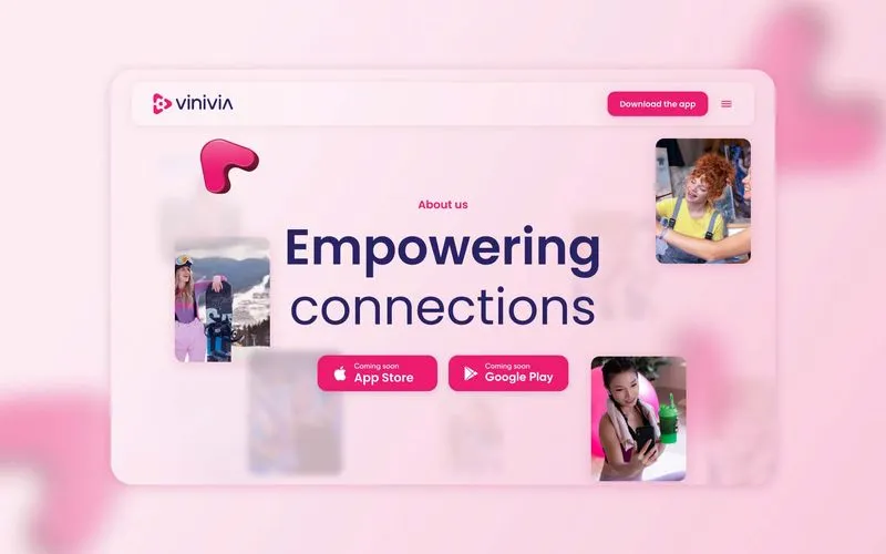
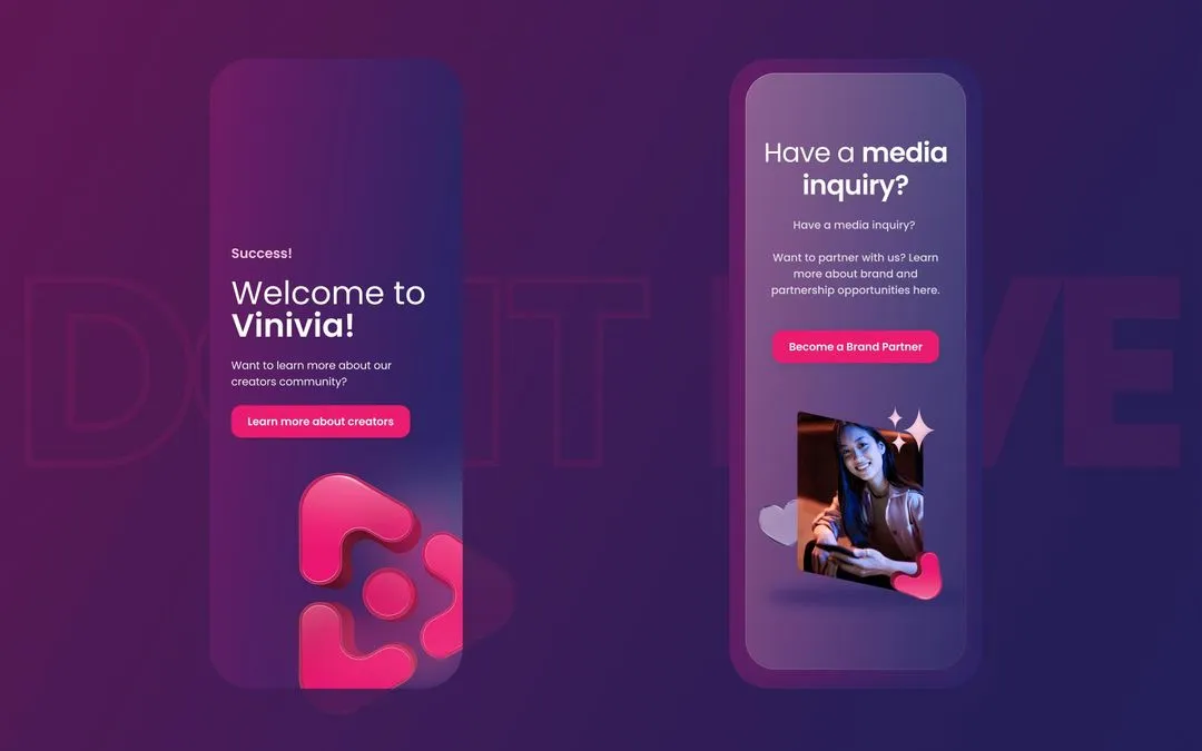
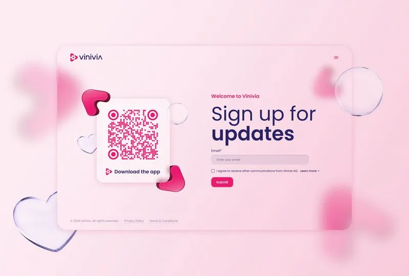
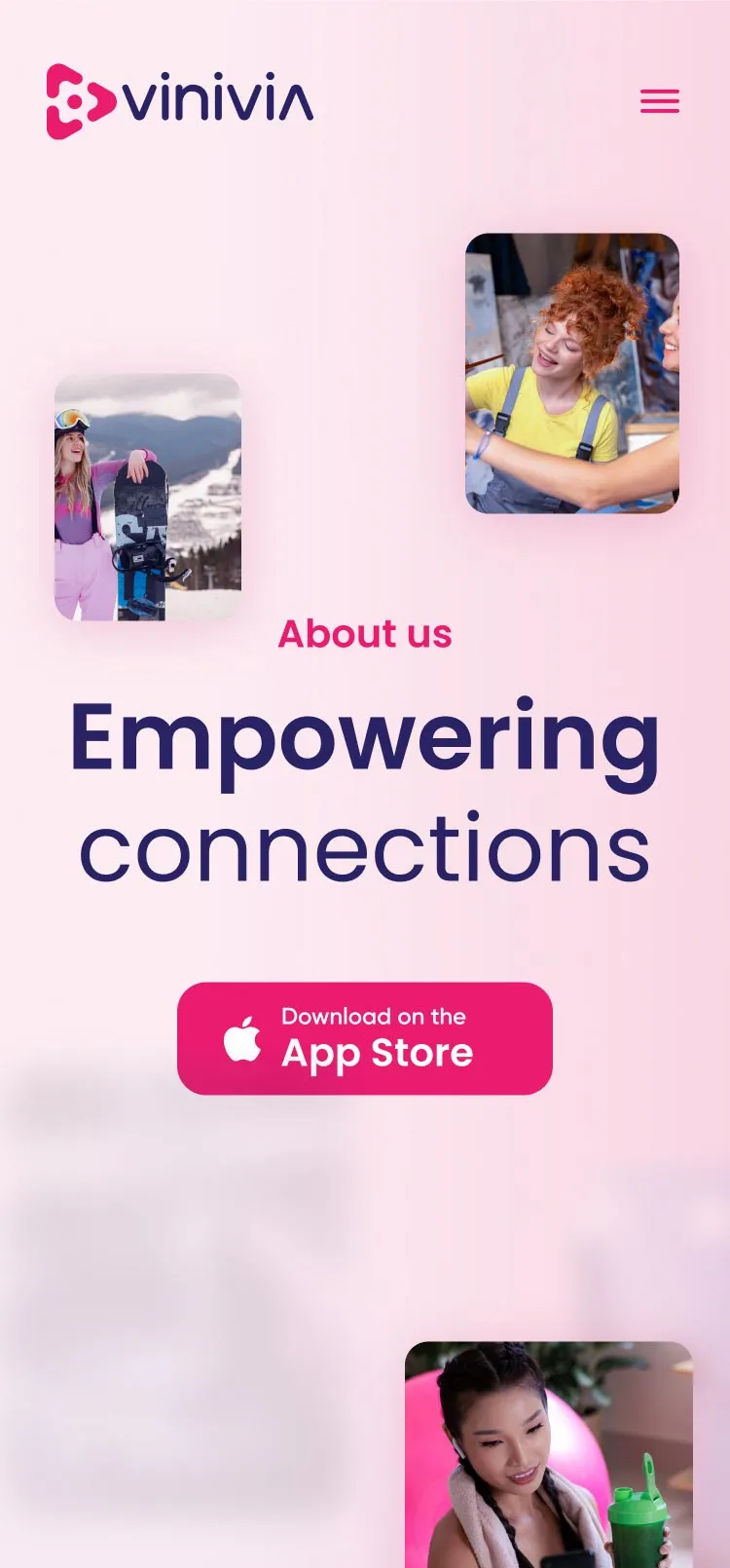
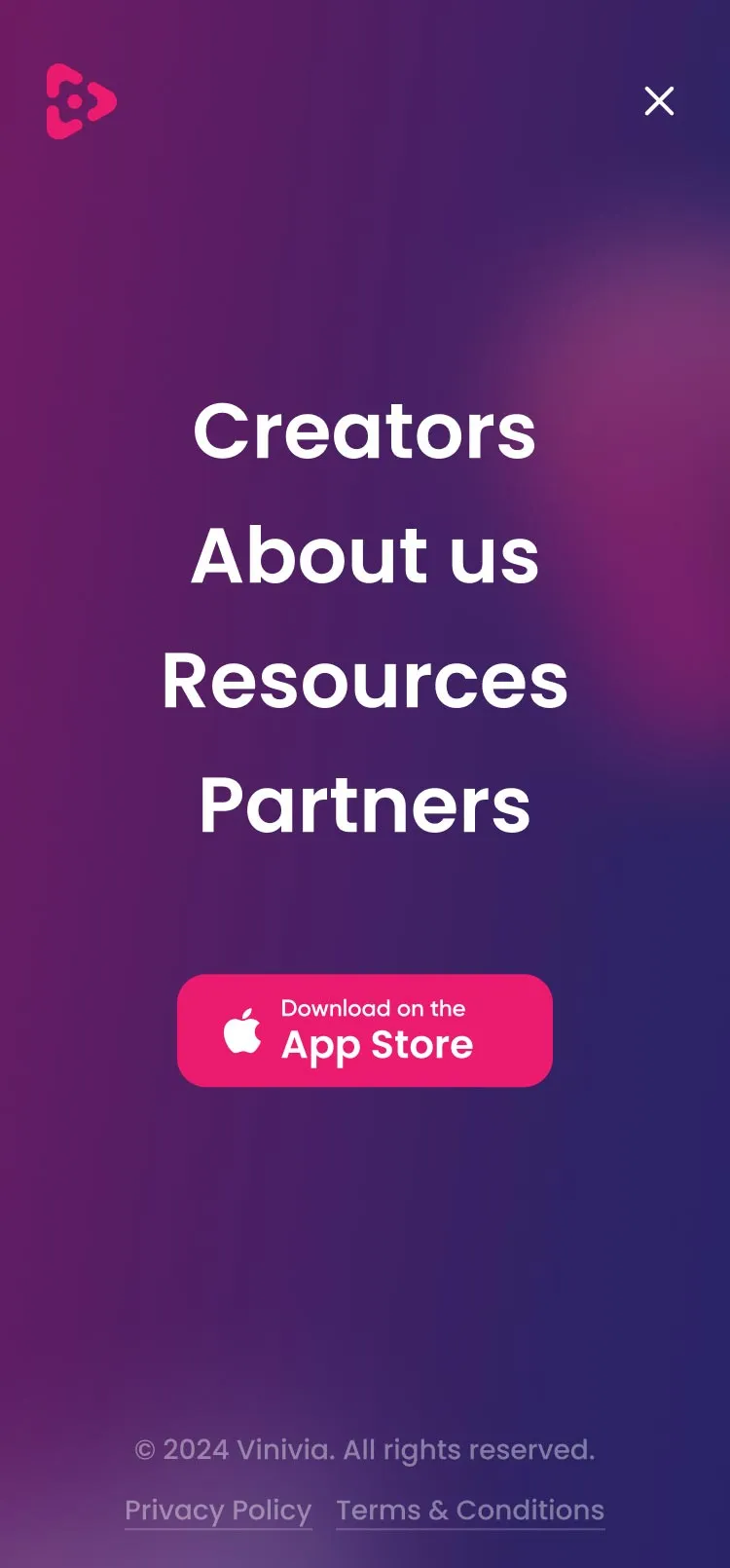
Amongst these requirements, one essential detail was ever-present: the need for app store CTAs. It was imperative to ensure the website could direct visitors to key app stores at any point in the user experience. The N4 team kept this front of mind, exploring and refining the points of engagement throughout the design process.
A video and animation-rich design, driven by Webflow
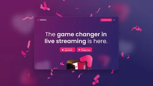
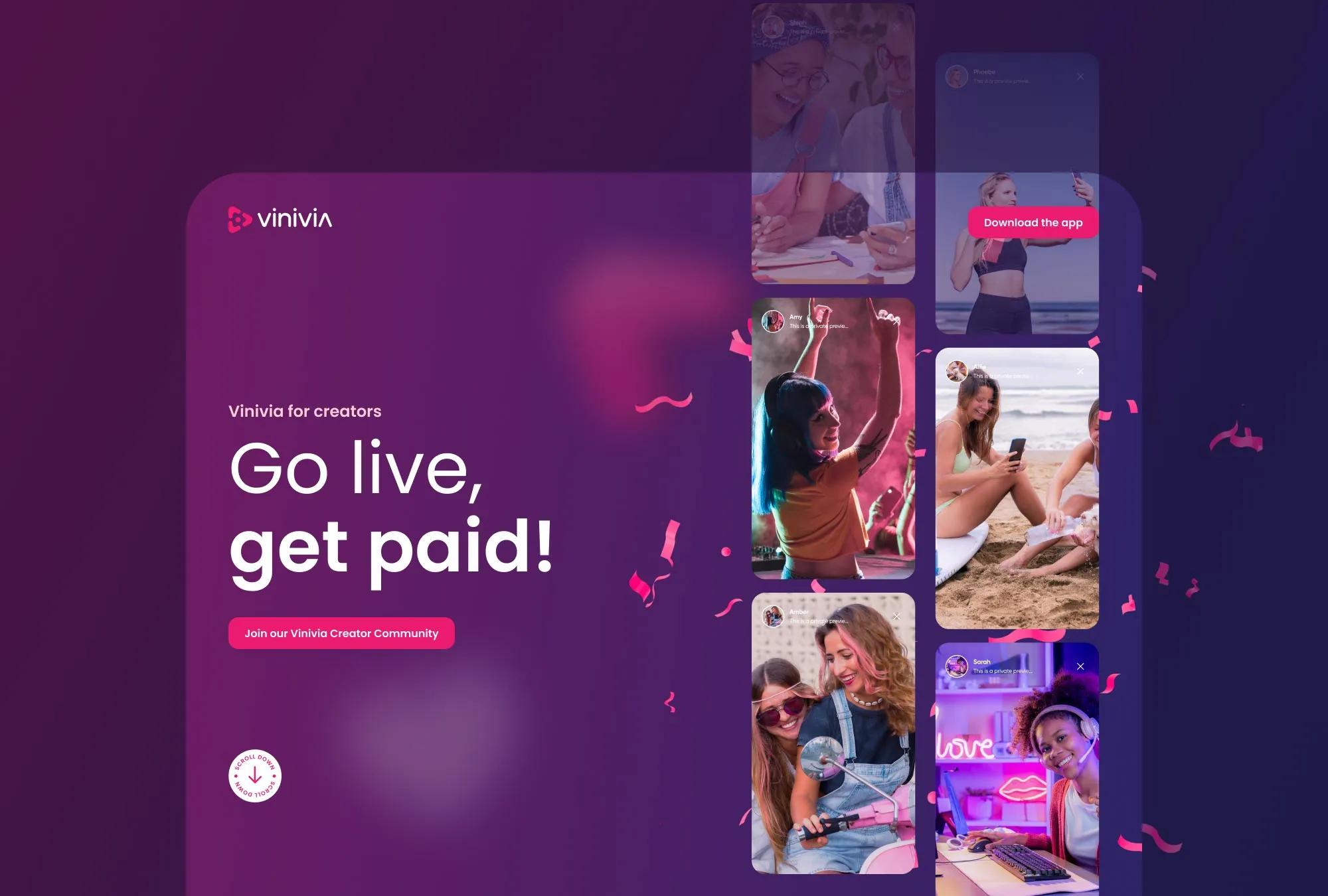
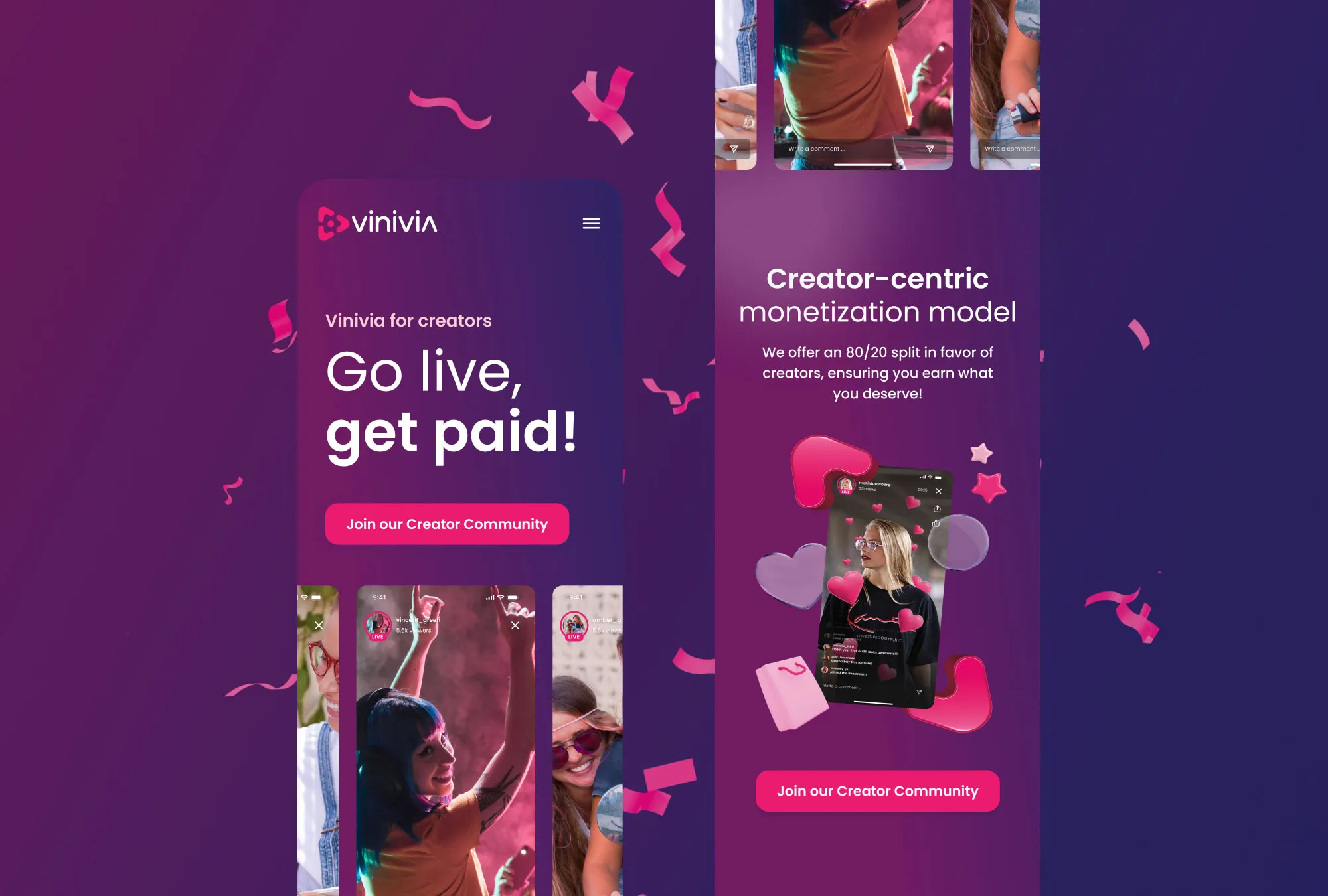
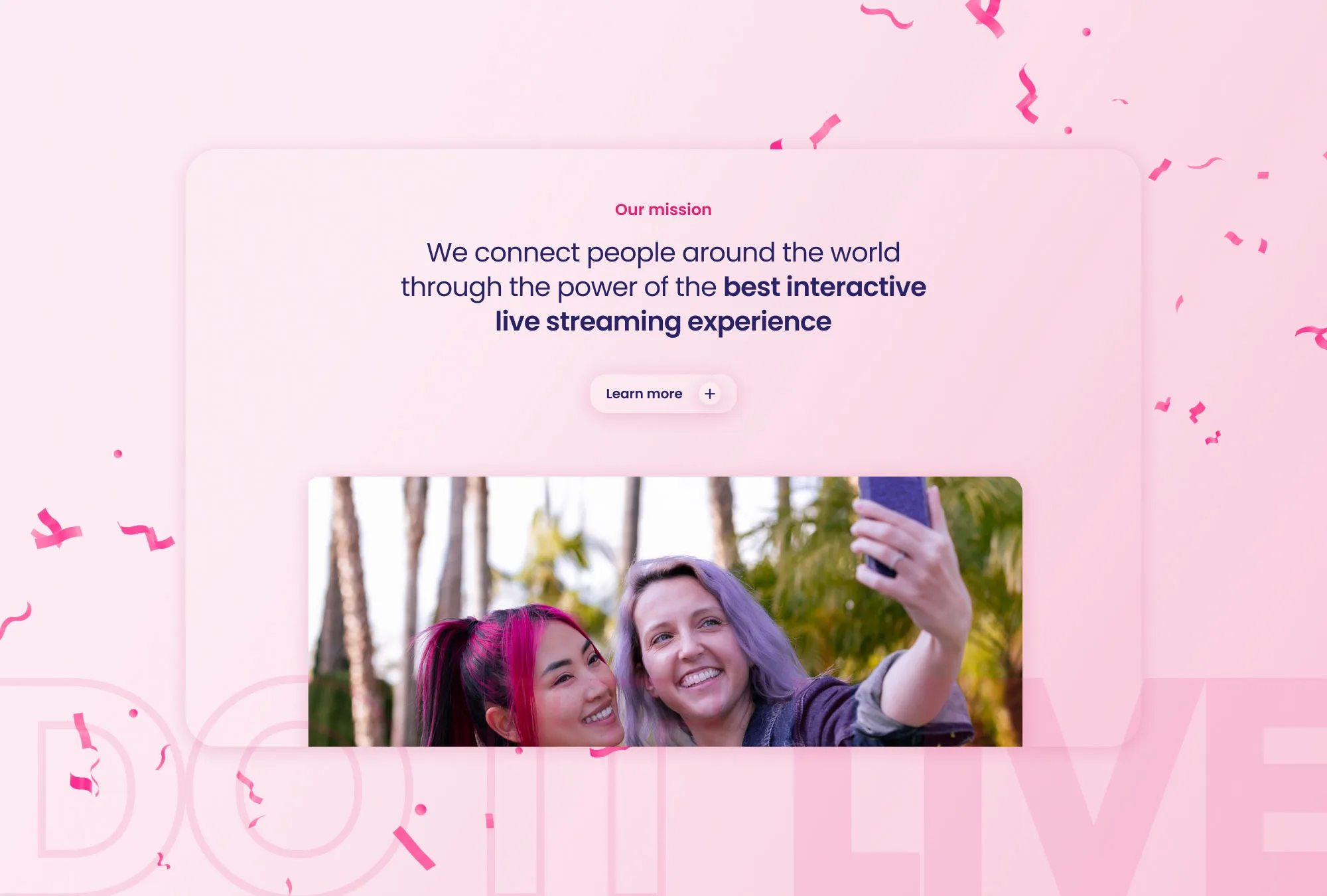
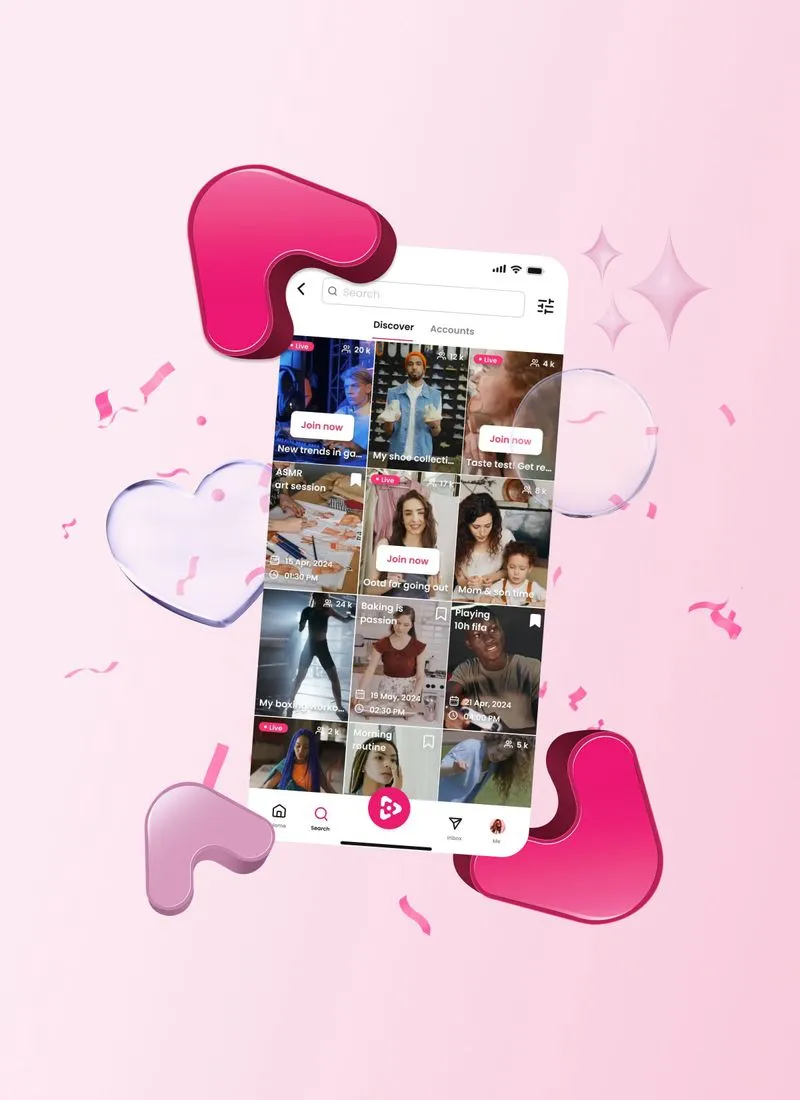
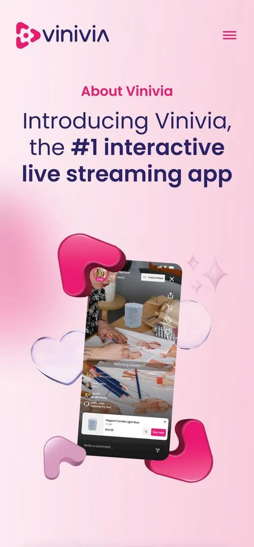
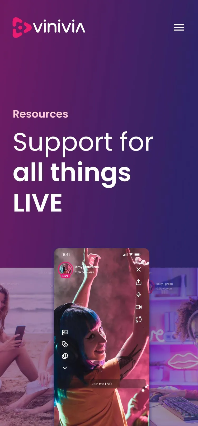
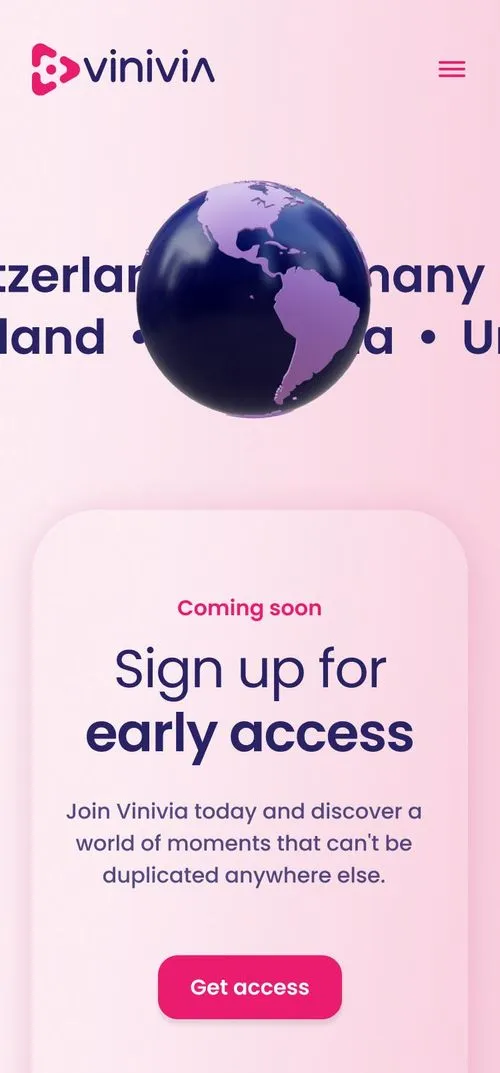
When visiting the website’s home page, users are met with a bold hero section that offers a hint of playful graphics, subtly encouraging further scrolling. Then, as the UI unfolds, these graphics become customary, combined with bite-sized animations and captivating video content.
Together, these multimedia components bring the Vinivia app to life, showcasing the dynamic and interactive nature of the live-streaming experience. Webflow plays a crucial role here, ensuring smooth playback and lending complete freedom to our Webflow designers.
Clear CTAs with playful character
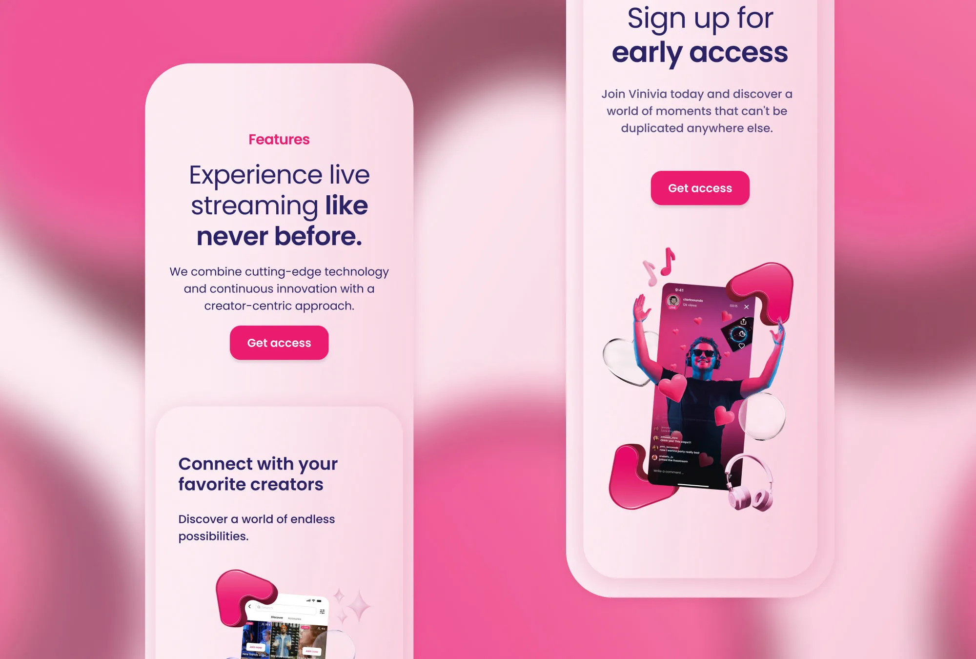
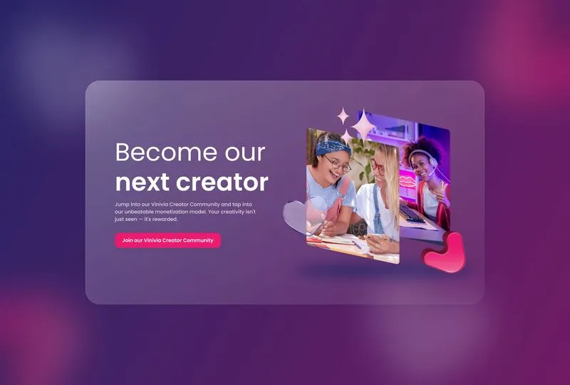
We prioritised a seamless user journey throughout Vinivia’s website by employing clear call-to-actions (CTAs). These points of engagement took the form of large, pink, interactive buttons — an easily identifiable feature, leaving no room for confusion about where to go next.
Clean transitions, built to engage
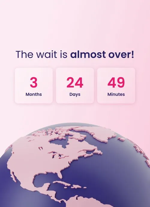
In further response to the brief’s emphasis on user engagement, the website also prioritises clean transitions, allowing for effortless movement. Our Webflow developers and designers worked closely together on this aspect to deliver visually smooth transitions that load quickly, preventing delays and keeping users engaged throughout their website exploration.
words

